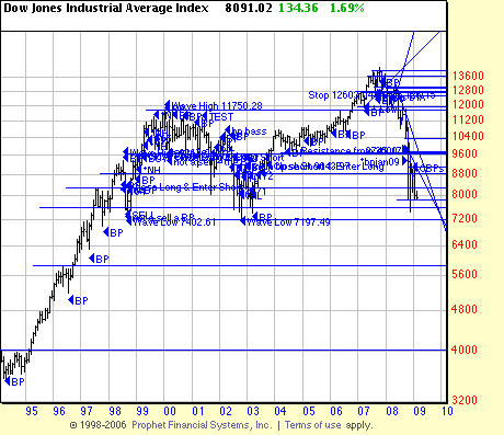
The long term chart of the Dow shows the market poised (like a porpoise) on the brink of a precipice. (Attention: awarders of the Nobel prize for alliteration!) Well you have a choice you can either cry your heart out over the market, or have a little fun. The long term chart here shows the black hole lurking beneath the market. Two things are supporting the market right now–the faint hope that Washington politicians will stop playing ideological games and enact a meaningful jobs bill and bottom fishers who are inspired by prices they never saw before. (As technical analysts know prices can always go lower–until they get to zero. (See FNM and FRE and AIG.) Seeing the faux conservatives posturing over the size of the jobs bill (after they spent a trillion dollars on a faux war in Iraq) is nauseating. Be that as it may — what does the analysis say about the potential downside in the Dow? Looks like about 5600-5700 in this analysis. Want to see some really low prices?
A pdf of this chart is posted at http://www.edwards-magee.com/Images09/


sorry the chart link seems to say file not found…