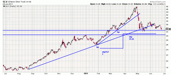
Looking at the silver chart against the gold chart several technical features immediately manifest themselves. The long term trendline which still holds out hope (uh-oh. Hope is the thing with wings which has ruined more portfolios than CDOs.) in the gold is broken in silver. So is the short term trendline — and bad things have already happened.
The Basing Point stop is illustrated in the horizontal line. We could possibly calculate a mildly higher stop, but that illustrated seems well placed to us.
The silver bullet referred to is the one you shoot yourself in the portfolio with if you don’t take the stops.
The silver lining is that Wimbledon is on.

